Color us intrigued: Paint companies parade their picks for 2023
Paint #Paint

Home Improvement  .
.
December 7, 2022 | 11:28 AM
Every year around this time — as leaves change and scatter, seasons transform, and holiday merrymaking officially kicks into gear — another chromatic tradition debuts: color-of-the-year selections from leading paint companies like Benjamin Moore, Glidden, and Sherwin-Williams. It’s like the Oscars of paint but also serves as a handy compendium of endorsements for anyone contemplating a décor makeover in the new year.
Whether you favor walls with or without a showy coat of paint, there are options aplenty.
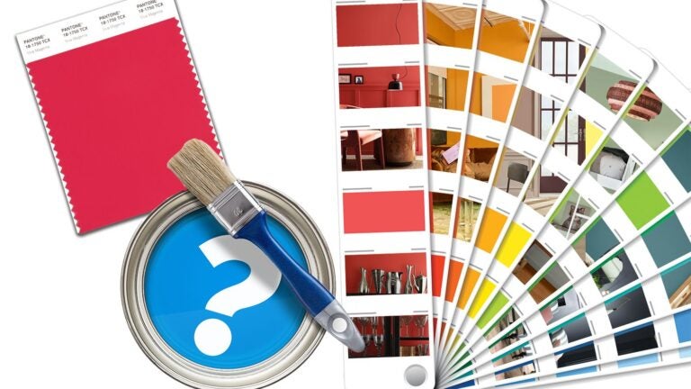
Pantone Color Institute, a global color authority and provider of professional color language standards and digital solutions used by industries across the world, declared “Viva Magenta” as the color of 2023, touting the striking shade of red as one that speaks to the strength and vitality needed for forging a more positive future. According to the brand, the color was chosen because it perfectly straddles the physical and virtual and is evocative of our multidimensional world.
 Pantone has selected “Viva Magenta” as its 2023 color of the year. — Pantone Color Institute
Consumers might consider this unexpected hue as an accent, but they still want rooms that feel cozy and instinctive. One year ago, nearly every leading paint company posited that sage was the “it color for interiors” for its ability to calm, nurture, and bring the essence of biophilia, or nature, indoors. Sage is still all the rage, along with other sophisticated and tonal neutrals.
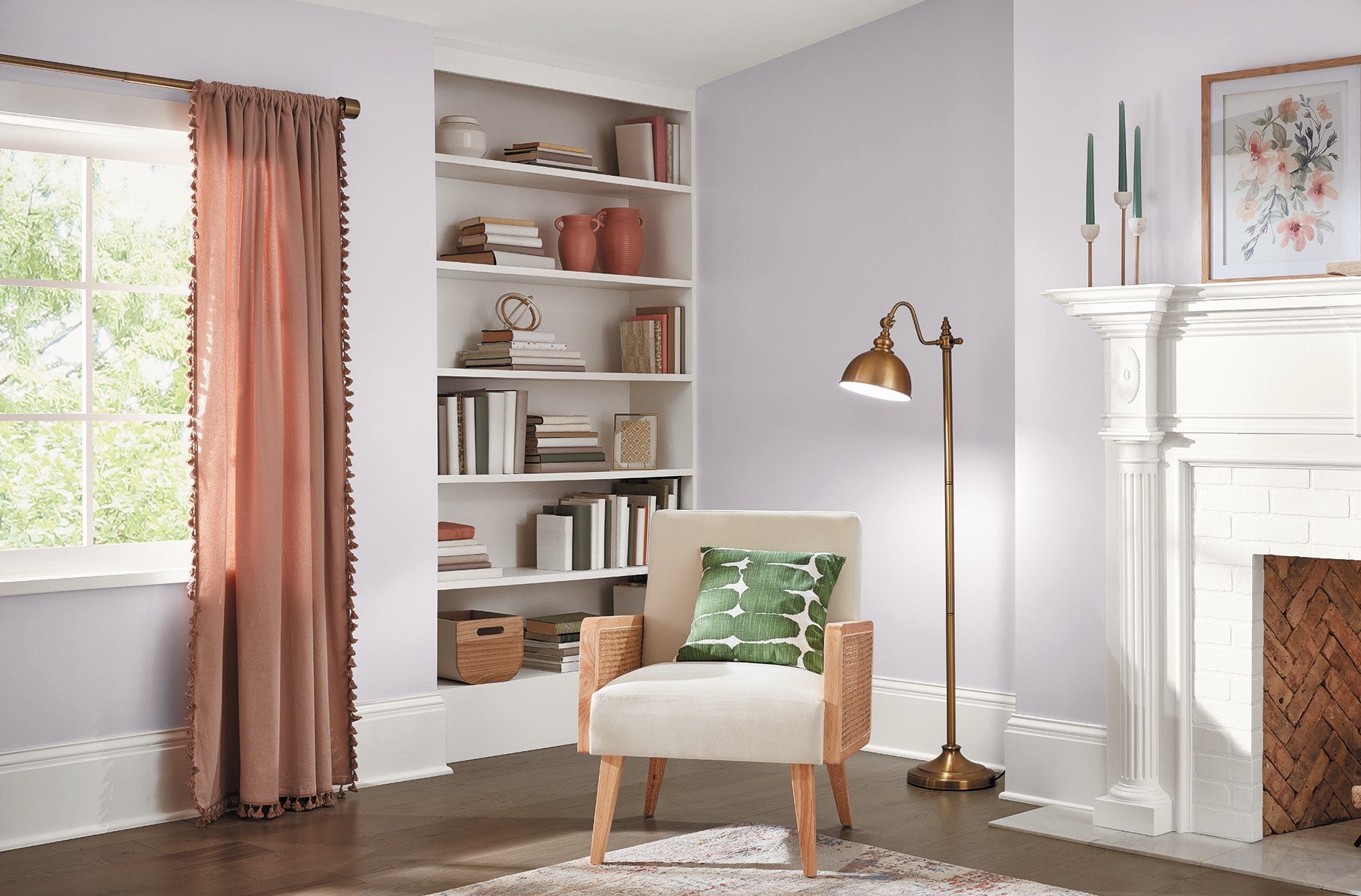
But neutrals these days are anything but basic beige. Paint brand Valspar presented 12 inspiring shades for consumers to consider in the coming year, including the delicately deceptive “Gentle Violet,” a neutral that skews gray but is actually a shade of white softened by a violet undertone, and “Villa Grey,” a cool-toned hue evoking the aesthetic of cotton muslin. “Natural and calming, this neutral creates mental balance which allows one to unwind and live a more mindful lifestyle,” said Sue Kim, color marketing manager for Valspar.
 “Gentle Violet” by Valspar. – Valspar
  “Villa Grey” by Valspar — ( Valspar / Valspar )
Glidden Paint by PPG opted for “Viving Ivy” for its paint pick for the new year, an adaptable teal the brand said is symbolic of deep water and optimal for creating a calming space.
“This color has been on my radar (and in my bedroom) for the past several years, and I am happy to see it getting the recognition it deserves!” said New York-based interior designer Samantha Gore, who paired the hue with a very pale apricot ceiling to play up the depth of color. “The color draws out the warmths of wood, the richness of velvet and mohair, and creates a snug space.”
 “Viving Ivy” by Glidden. — ( Artjafara / Getty Images/iStockphoto )
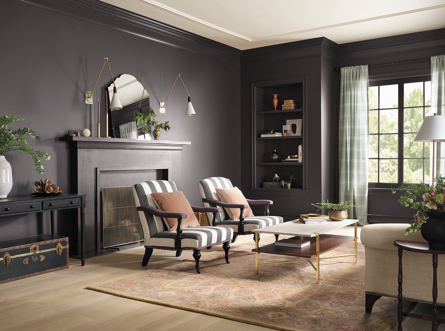
The Vintage Homestead Color Collection from HGTV Home by Sherwin-Williams spotlights 10 distinct shades influenced by the romance and heritage of bygone eras. Out of this nostalgic palette — which includes selections of plum, gold, and cocoa — is “Darkroom,” a novel shade of black with slight purple undertones, selected as its principal color for 2023.
 “Darkroom” from HGTV Home by Sherwin-Williams. – Sherwin-Williams
“This is such a moody and evocative color. It could create a cocooning effect in any space,” said Atlanta interior designer Bradley Odom. “I’d love to see this as a kitchen cabinet color in a light-infused space. It’s unexpected to go almost black on your cabinets but sets a nice intentioned tone in a place that’s usually thought of as more functional.”
Alternatively, for rooms in need of a bright and light start instead, consider “Blank Canvas” from Behr, a fresh-but-versatile shade of white with undertones of brown and gray fitting for a modern design scheme suffused with wood tones and black accents.
Address newsletter
Get the latest news on buying, selling, renting, home design, and more.
Sherwin-Williams is celebrating “Redend Point” as its color of the year, a soulful blush-beige with desert vibes. “It is a heartening hue that invites compassion and connection into any space,” said Sue Wadden, director of color marketing at Sherwin-Williams.
New York City-based interior designer Jennifer Hunter said this earthy tone can be used in unexpected ways to powerful effect. “This color would be lovely in a large pantry to warm up the space while creating dimension and separation from the kitchen.” Another option, Hunter said, is in a sleeping space. “Go for it in a bedroom for a cozy and feminine appeal that doesn’t skew overly pink.”
 “Redend Point” by Sherwin-Williams. — Sherwin-Williams
Unsure of how to accessorize around this particular shade? Online marketplace Etsy has partnered with Sherwin-Williams to offer a color-compatible collection of furniture and housewares to bring layers and textures into home spaces.
For true color enthusiasts, there’s “Raspberry Blush” from Benjamin Moore, a saturated red-orange that wakes up the senses. “People are ready to bring color back into the home, taking a step outside their color comfort zones,” said Andrea Magno, the company’s color marketing and development director.
 “Raspberry Blush” by Benjamin Moore. — Benjamin Moore
C2 Paint is promoting “Tiramisu” as its color of the year, a restorative midtone shade of cedar inspired by the diverse range and tonalities of natural wood. “Our paint provides a canvas that’s less like paint and more like art,” said Tia Clarida, C2 Paint marketing director. This particular shade, according to the brand, is ideal background scenery for showcasing art and furnishings.
 “Tiramisu” by C2 Paint. — ( C2 Paint / lilasgh – stock.adobe.com )
Backdrop, the online paint brand that collaborated with Dunkin’ in 2021 to bring its popular pink and orange colors to walls, recently added fresh options to its thoughtfully curated collection, including one tint brazenly dubbed “Color of the Year,” an electric yellow-orange, as well as a saturated kelly green named “Troop Beverly Hills,” which delivers peppy energy to any area, including upon a front door.
 “Troop Beverly Hills” by Backdrop. — Backdrop
  “Color of the Year” by Backdrop. — Backdrop
With a long and dusky winter now upon us, this vivaciously verdant shade may be the invigorating boost of greenery we need right now.
***
Hue got it: Local designers reveal their go-to colors
The good thing about paint: It’s a fairly easy way to spiff up any living space, and there are illimitable options. Here, four Bay State design experts sound off on the favorite colors they love to use and talk about.
Jess Cooney
Jess Cooney Interiors
Great Barrington
“Intense White” by Benjamin Moore
This “is my go-to white right now. It’s soft and neutral and gives a beautiful, soft, moody feel to any space. And it works with cool and warm tones incredibly well.”
Vani Sayeed
Vani Sayeed Studios
Newton
“Lipstick on the Mirror” by Backdrop
“Jewel tones are back! This warm, rich red brings cheer to any space. Used as a statement or an accent color, you can’t go wrong.”
Barbara Neulinger
Color consultant
Florence, Mass.
“Powell Smokehouse” and “Lime White” in Benjamin Moore’s Williamsburg Collection
“It’s a luxurious gray mauve with a timeless quality. With a deep color such as this, balance with a toned-down white on the ceiling, like ‘Lime White.’”
Josh E. Linder
Evolve Residential
Boston
“Hague Blue No. 30″ by Farrow & Ball
“This color is always one of my favorites! I love to use it for a small space between larger rooms, a powder room, or a moody area like a library.”
Christina Poletto lives in New York City, where she writes about unusual old homes and interior design trends. Follow her on Instagram @christina_poletto.