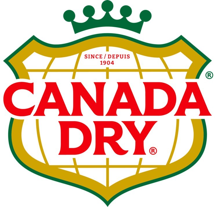
Canada Dry® unveils new logo, rebrands
Canada Dry #CanadaDry


Canada Dry® Brand Refresh (CNW Group/Canada Dry Mott’s Inc.)
TORONTO — On Oct. 6, Canada Dry® unveiled its new visual brand identity that will be applied to all Company assets, including Canada Dry Ginger Ales and mixers, such as Club Soda and Tonic Water. This rebranding is reminiscent of prior logos and images that the company has used in the past.
“This new look encapsulates everything Canada Dry stands for, as a brand grounded in nostalgia, but always facing the future for growth,” said Keurig Dr Pepper Canada Vice President of Marketing, Tebbie Chuchla. “As we focus on strategically growing this brand with the next generation of Canada Dry fans, evolving the brand’s identity so that it better resonates with both current and future users will be critical to Canada Dry’s success. We know that Canada Dry will remain a central part of our consumers’ lives and the beverage they return to for a comforting taste of home.”
The newly unveiled branding include a return to Canada’s Dry’s old logo, which includes visual elements such as the old Canada Dry shield, and the latitude and longitudinal lines, which signify the map of Canada. The company says the logo has been streamlined, for a clean and modern look behind the newly redrawn wordmark.
The company also says that this design outperformed in all key metrics during testing, including stopability, ownability and findability, to ensure the new look makes an impact with consumers on the shelf.
Canada Dry’s new look is highlighted in the brand’s new ‘Tastes Like Home’ campaign, across social media and has started to roll out on shelves across the country.